User Interface Guide
Overview
Vapor features a modern, intuitive interface with a clean design. This guide will help you navigate and use the interface effectively.
Interface Layout
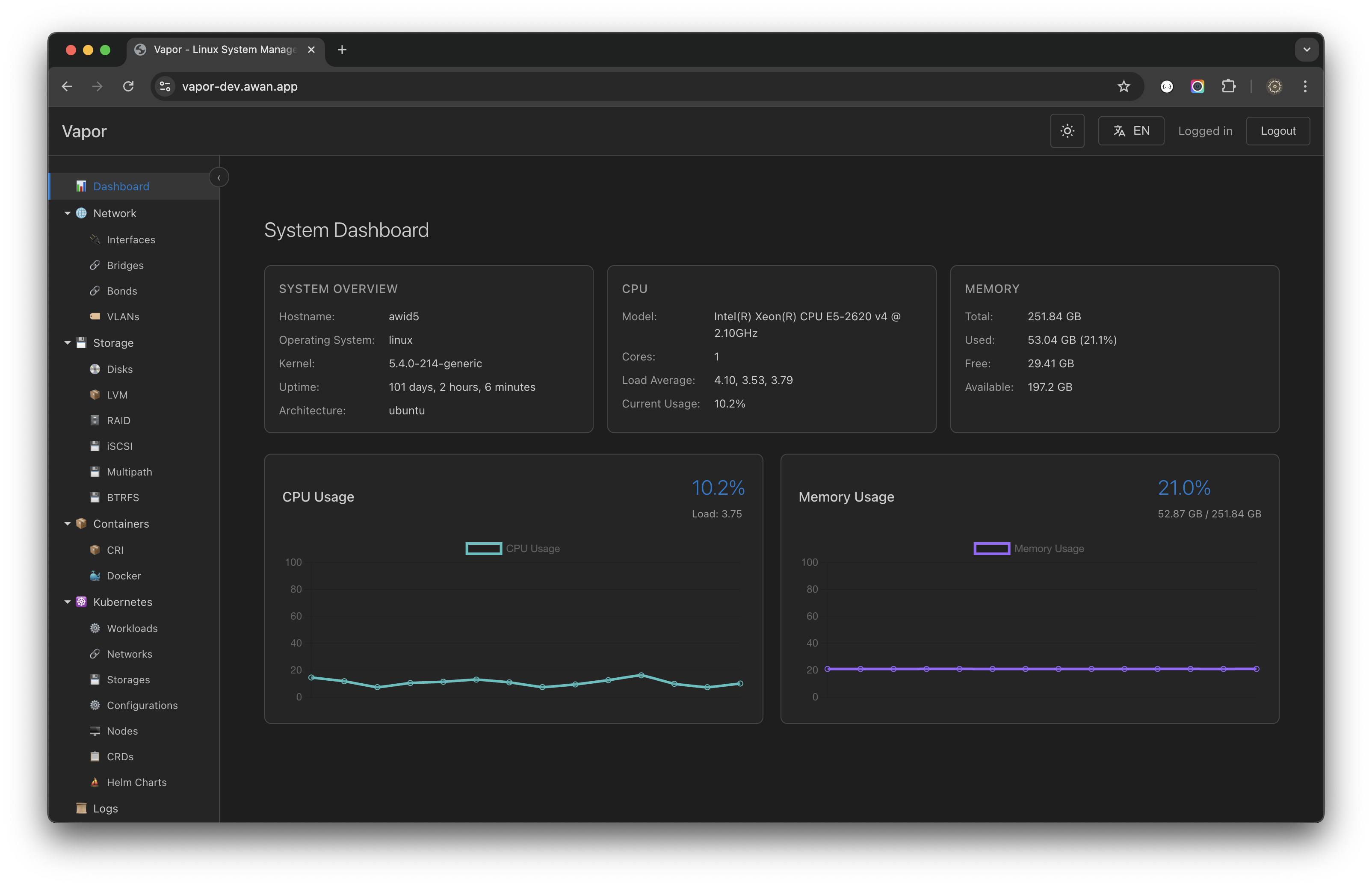
The Vapor interface consists of four main areas:
1. Top Bar
Located at the top of the screen:
- Vapor Logo: Home/Dashboard link
- Spacer: Flexible space
- Theme Toggle (🌓): Switch dark/light themes
- Language Selector (🌐): EN/ID language switch
- User Menu: Logged in user and logout
2. Sidebar
Collapsible navigation panel on the left:
- Tree-style navigation
- Expandable sections
- Active item highlighting
- Keyboard navigation support
3. Main Content Area
Central workspace showing:
- Tabbed interface
- Multiple open views
- Breadcrumb navigation
- Context-specific content
4. Status Bar
Bottom information panel:
- Connection status
- System messages
- Quick stats
- Activity indicators
Navigation
Sidebar Navigation
The sidebar uses a hierarchical tree structure:
Vapor
├── 📊 Dashboard          (System overview)
├── 🌐 Network           (Network management)
│   ├── Interfaces       (Network interfaces)
│   ├── Bridges          (Network bridges)
│   ├── Bonds            (Network bonding)
│   └── VLANs           (VLAN configuration)
├── 💾 Storage           (Storage management)
│   ├── Disks           (Physical disks)
│   ├── LVM             (Logical volumes)
│   ├── RAID            (RAID arrays)
│   ├── iSCSI           (iSCSI targets)
│   ├── Multipath       (Multipath devices)
│   └── BTRFS           (BTRFS volumes)
├── 📦 Containers        (Container management)
│   ├── CRI             (CRI containers)
│   └── Docker          (Docker containers)
├── ☸️ Kubernetes        (K8s management)
│   ├── Workloads       (Pods, Deployments)
│   ├── Networks        (Services, Ingress)
│   ├── Storages        (PVC, StorageClass)
│   ├── Configurations  (ConfigMaps, Secrets)
│   ├── Nodes           (Cluster nodes)
│   ├── CRDs            (Custom resources)
│   └── Helm Charts     (Package management)
├── 📜 Logs              (System logs)
├── 👥 Users             (User management)
└── 🖥️ Terminal          (Web terminal)
Themes
Dark Theme (Default)
- Reduced eye strain
- Better for long sessions
- Optimized contrast
- Modern color scheme
Light Theme
- Better in bright environments
- Print-friendly
- High contrast
- Clean appearance
Switching Themes
- Click the 🌓 icon in top bar
- Theme changes immediately
- Preference saved automatically
- Per-user settings
Language Support
Available Languages
- English (EN): Default language
- Bahasa Indonesia (ID): Full translation
Switching Languages
- Click 🌐 in top bar
- Select desired language
- Interface updates instantly
- Includes all text and formats
Language Features
- Translated UI elements
- Localized date/time formats
- Number formatting
- Error messages
- Help documentation
Common UI Elements
Buttons
Primary Buttons
- Blue background
- Main actions (Create, Save, Apply)
- Keyboard accessible
Secondary Buttons
- Outline style
- Secondary actions (Cancel, Close)
- Less emphasis
Danger Buttons
- Red color
- Destructive actions (Delete, Remove)
- Require confirmation
Forms
Input Fields
- Clear labels
- Placeholder text
- Validation feedback
- Error messages
Dropdowns
- Search functionality
- Multi-select support
- Keyboard navigation
- Clear selection
Tables
Features
- Sortable columns
- Search/filter
- Pagination
- Row selection
- Actions column
Table Interactions
- Click headers to sort
- Use search box to filter
- Select rows for bulk actions
- Click actions for row operations
Modals
Modal Types
- Information: Display details
- Confirmation: Verify actions
- Forms: Data input
- Wizards: Multi-step processes
Modal Controls
- Close button (×)
- Cancel/OK buttons
- Escape key to close
- Click outside to close (optional)
Real-time Updates
WebSocket Indicators
- 🟢 Connected - Real-time active
- 🟡 Connecting - Establishing connection
- 🔴 Disconnected - No real-time data
Auto-refresh
- Dashboard metrics
- Container status
- Log streaming
- System events
Responsive Design
Desktop Experience
- Full sidebar navigation
- Multiple columns
- Hover interactions
- Keyboard shortcuts
Tablet Experience
- Collapsible sidebar
- Touch-optimized
- Simplified layouts
- Gesture support
Mobile Experience
- Hamburger menu
- Single column
- Touch targets
- Simplified interface
Accessibility
Keyboard Support
- Full keyboard navigation
- Focus indicators
- Skip links
- Shortcut keys
Screen Readers
- ARIA labels
- Semantic HTML
- Status announcements
- Form descriptions
Visual Aids
- High contrast mode
- Focus outlines
- Error indicators
- Loading states
Performance
Optimization Features
- Lazy loading
- Virtual scrolling
- Efficient updates
- Resource caching
Best Practices
- Close unused tabs
- Use filters in large lists
- Enable pagination
- Limit real-time updates
Customization
User Preferences
- Theme selection
- Language choice
- Dashboard layout
- Notification settings
Workspace
- Tab arrangements
- Sidebar width
- View preferences
- Sort orders
Tips and Tricks
Productivity Tips
- Use keyboard shortcuts for faster navigation
- Pin frequently used tabs for quick access
- Customize dashboard for your workflow
- Use search instead of browsing
- Set up filters for common views
Interface Tips
- Double-click sidebar border to reset width
- Middle-click links to open in new tab
- Shift-click to select multiple items
- Ctrl-click for non-contiguous selection
- Right-click for context menus
Troubleshooting UI Issues
Display Problems
- Clear browser cache
- Check zoom level (Ctrl+0 to reset)
- Disable browser extensions
- Try different browser
Performance Issues
- Close unnecessary tabs
- Reduce update frequency
- Check network connection
- Monitor browser resources
Missing Elements
- Refresh the page (F5)
- Check permissions
- Verify feature availability
- Review console errors
Next Steps
Now that you understand the interface:
- Explore the Dashboard
- Learn Network Management
- Configure User Preferences